
When asked what your favorite color is, there are good reasons to suspect that your answer will be none other than blue. Not because of divination skills: the majority of Western citizens agree with that opinion. In a survey of 2,000 people for the long seller Color psychology (Editorial GG), by the German Eva Heller, 46% of men and 44% of women chose it as their favorite, while only 1% of men and 2% of women stated that they did not like it. Green, in comparison, had 16% followers among them and 15% among women. Asked about the feelings that their favorite inspired in them, the subjects of the survey agreed in associating it with eminently positive emotions: sympathy, harmony, friendship, trust. Although many of the participants related it to cold, intelligence and the masculine, in tradition this has been, contrary to the arbitrariness imposed on babies’ clothes, an emblem of the feminine: Iris (lily), Celeste or Sapphire are women’s names.
With its 111 shades of blue email to Chagall, from Copenhagen blue to midnight, this color dazzles: every day you see blue jeanscars with that paint multiply on the street and, spread on the walls of our homes, it instills a calming effect, as Heller relates. Blue, as in that pill, is the color of things that do not change. There is only one place where blue is not liked, and that is the plate. In its multiple incarnations it seems divine: vast, deep and artistic.
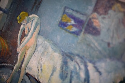
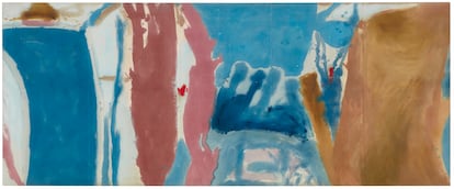
Countless writers, painters, filmmakers and musicians have sung their odes to the blue muse: Van Gogh, Picasso, Matisse and Helen Frankenthaler were fixated on him, he vibrates in the exaltation of the passion of the Azul by Rosa Regàs, it is exciting to see life go out in the blue nights by Joan Didion and in the Tangled Up in Blue Nobel Prize winner Bob Dylan. In the iconic Azul from the film trilogy three colorsby Krzysztof Kieślowski, the filters and objects are bathed in blue to evoke the lead motive of the search for freedom that the film champions. The melancholy carried by the air of the blues African American comes from its meaning in English: blue alludes to the dark feeling of depression (and also, like green here, to pornography).
In the Spanish language, the poet Rubén Darío wrote in History of my books that blue is “the color of dreaming, the color of art, a Hellenic and Homeric color, an oceanic and firmamental color, the coeruleum, which in Plinio is the simple color that resembles that of the heavens and sapphire.” In that 1916 essay, the Nicaraguan thus turned his sights to his magnum opus, the celebrated book of stories and poems from 1888 that, with the evocative title of Azul…dressed in that dye, inaugurated the era of literary modernism in Spanish, a withdrawal of the self towards the interior protected by the search for formal beauty and symbolism.
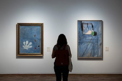
Walking alongside the letters, that movement permeated all the arts. Victor Hugo had already stated that “art is blue” (art is blue), and on that premise and under the influence of Darío’s book it was inaugurated in 2019 at CaixaForum Blue, the color of modernisma journey in the wake of that color in the painters and incipient filmmakers of the period between the end of the 19th century and the beginning of the 20th. With works by Santiago Rusiñol, Joaquín Torres García and Gustave Courbet, that exhibition proved that yes, naturally occurring blue and its then-new artificial tones, such as Prussian blue, turned out to be a favorite color of modernism. The European Renaissance also revered the fabulous lapis lazuli and, in the 20th century, explorers such as the neo-Dadaist Yves Klein made a name for themselves in their near-mystical search for the purest blue, materialized in the IKB, the International Klein Blue.
Installed in an abysmal vision of blue, one of the three primary colors along with red and yellow, it does not currently cause the same impression that it generated on the modernists, nor did they come to it with the same predisposition as their predecessors. As the curator of that CaixaForum exhibition, Teresa M. Sala, explains, “the perception of colors changes.” And he explains: “It is not the same now as when electricity did not exist, or when the palette began to expand through artificial pigments during industrialization.” And, above all, as Goethe already introduced in his color theory (GG Editorial), it is convenient to separate the color optics discovered by Newton from the psychology of its perception, something that all contemporary artists and designers assimilated over time.
Subject to the oscillations of taste and fashions, the perception of color is a matter of sense, that of sight, and also sensitivity, that of which Rubén Darío gave lyrical touches in his description of the “color of dreams”, but which the historian Michel Pastoureau would point out indirectly in works such as his monumental Blue. History of a color (Flipscope): It could not be said that it is a Hellenic or Homeric color. As Daniel Entrialgo also remembers in the recent When the sea was not blue (Espasa), the author of the Iliad describes the sea as the color of wine, and due to the imprecision of the terminology they used and the infrequency of its artistic expression, scholars at the end of the 19th century came to the question of whether Greeks and Romans were blue-blind.
It is now known that the senses of ancient civilizations worked exactly like ours, so it is crucial not to ignore “the distance, sometimes considerable, that exists in all times, all societies and all individuals, between the “real” color (if that adjective means anything), the perceived color and the named color,” as Pastoureau writes. For the Romans, in addition to the fact that the blue pigment was difficult to obtain and fix with the nature they had at their disposal, was added the circumstance that they related it to the barbarians, in such a way that there was not a single tone that was acceptable to them. “It is unaesthetic when it is light and disturbing when it is dark, (because) it is often associated with death and hell,” says Pastoureau.
Listed as one of the wonders of Marco Polo’s travels, if there is a mythical variant of the color blue, it is ultramarine, obtained, as the Italian designer Riccardo Falcinelli explains in Cromorama (Taurus), of “the reduction to powder of a semi-precious stone, lapis lazuli, which arrives in Europe in ships from distant countries, from ‘beyond’ the Mediterranean.” Although there are deposits of lapis lazuli in mines in Chile, Zambia and Siberia, its fundamental origin is in the mountains of Afghanistan.
On a risky trip in search of that almost magical rock, British journalist Victoria Finlay traveled to the home of the Bāmiyān Buddhas in 2000, shortly before the Taliban destroyed those colossal figures accompanied by frescoes decorated in blue. “The ultramarine still shone—barely—on the ruined walls,” Finlay recalls in Color. History of the color palette (Captain Swing), “and it was extraordinary to think that this was the first known use of the pigment.”
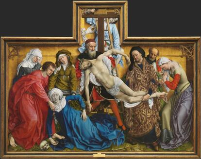
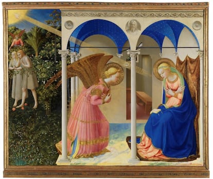
When in 2019 the Prado Museum restored one of its best-known worksThe Annunciation painted by the early Renaissance master Fra Angelico around 1430-1432, the recovered luminosity of the lapis lazuli that decorates the vaults and the mantle that cover the Virgin was a true discovery: the pigment, until then opaque and flat, came to life in its most intensely brilliant and deep tone. “The difference lies in the quality of the ultramarine and the technique used by the painter,” says Almudena Sánchez, the hand in charge of that restoration. Two excellent qualities of which The annunciation can brag. “Starting in the 17th century,” adds Sánchez, “lapis lazuli is used much less, replaced by azurite, but this tends to alter over time.” Seeing its extraordinary performance after 600 years, it is not surprising that ultramarine holds the record for being the most expensive color of all time.
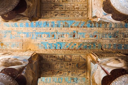
Although blue did not establish itself as a favorite until the 17th and 18th centuries, finally appreciated, as Pastoureau says, as “a beautiful color, the color of the Virgin and of kings” and thus rivaling red, from a newly discovered pigment from the Paleolithic era to its use in Egyptian temples, Chinese porcelain or Gothic stained glass, blue appears to us as a fascinating color whose traces can be traced throughout the course of history. As Benjamín Labatut narrates in A terrible greenery (Anagrama), has even changed its course: the first modern synthetic pigment, Prussian blue, gave rise to the hydrogen cyanide used to make the lethal pesticide Zyklon, and was used by Nazi leaders such as Hermann Göring to commit suicide before receiving their punishment. Today it flies as the color of peace, embodied in a blue flag, and in clothing throughout the ages it has been the most popular dye, extracted from the indigo plant.
Its symbolism, perhaps above other colors, unfolds like an unfathomable enigma, a chromatic circle without beginning or end, as demonstrated by the very broad imprint it has left on the arts, and which continues to this day inscribed in the work of current creators such as the late Matthew Wong. Now that our eyes shine all the time with the blue that the screens reflect in our pupils, perhaps the time has come to go outside and observe the sky in full color again, with its shades of cloud gray, dawn orange or twilight violet.